Mike & Grape labels
Illustration & Labelling
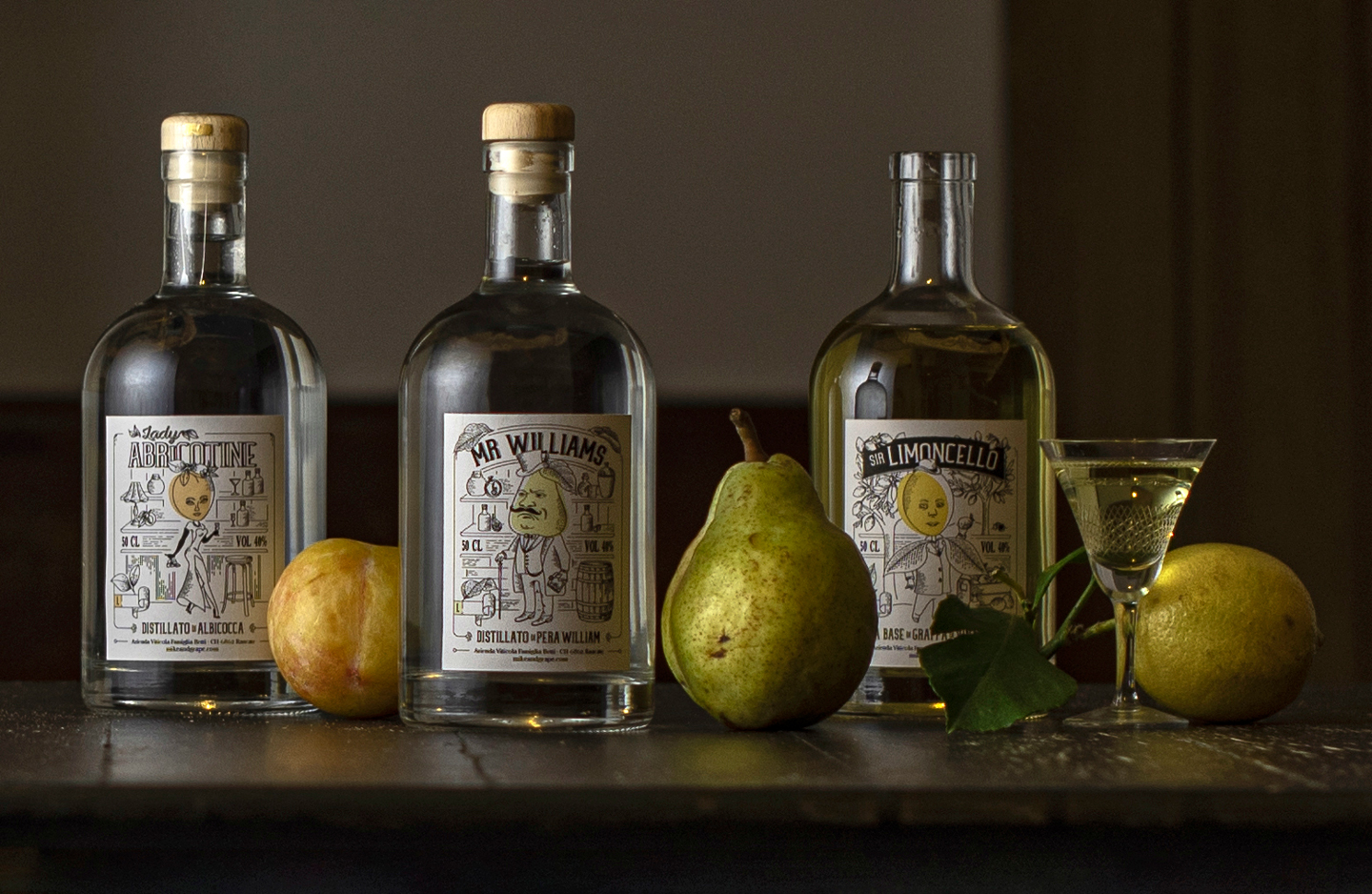
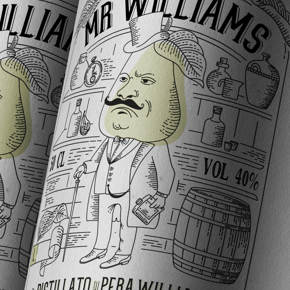
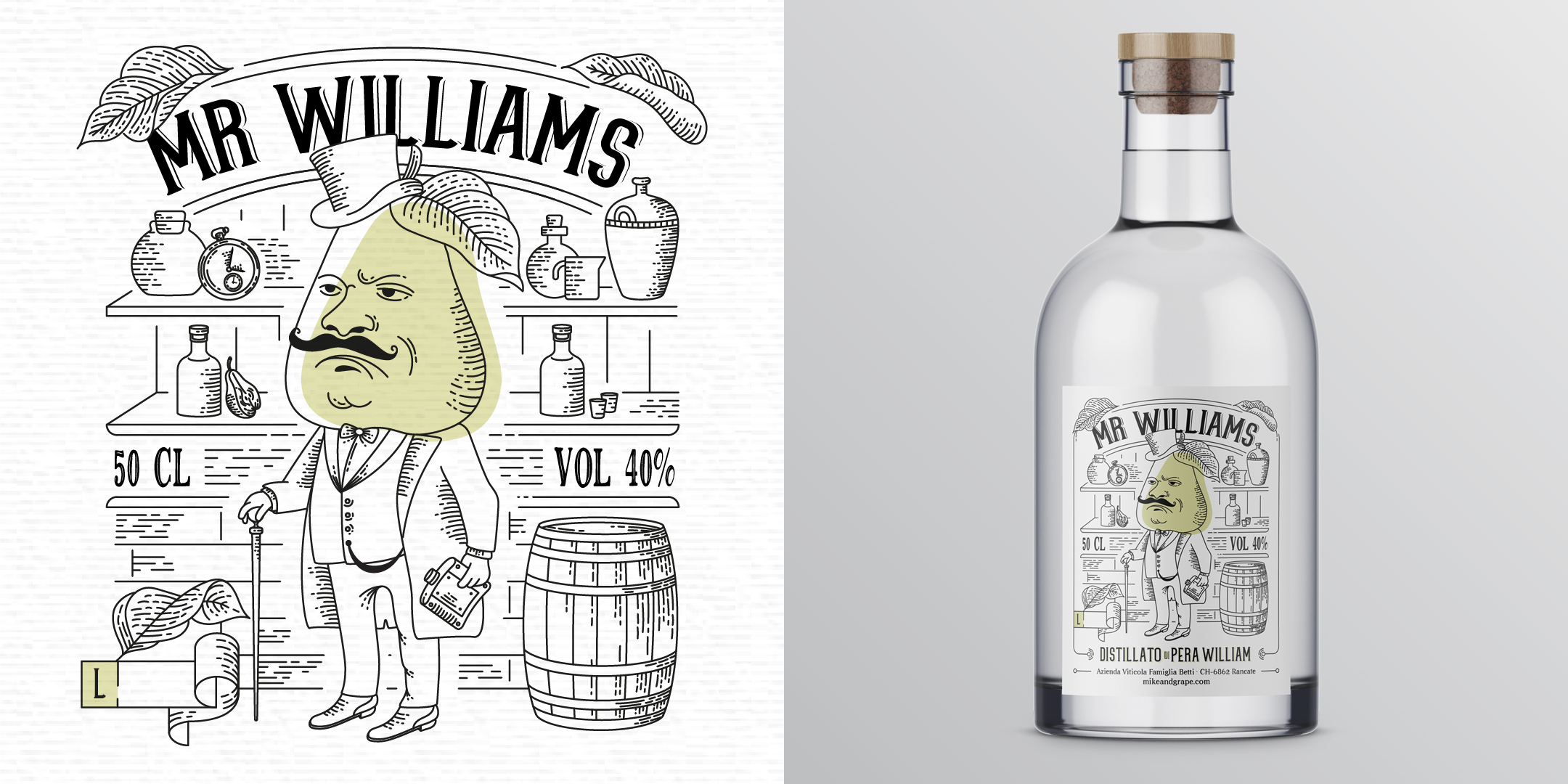
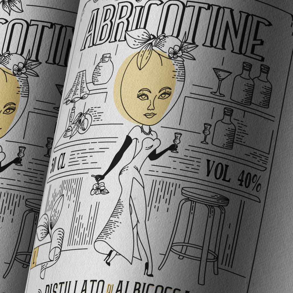
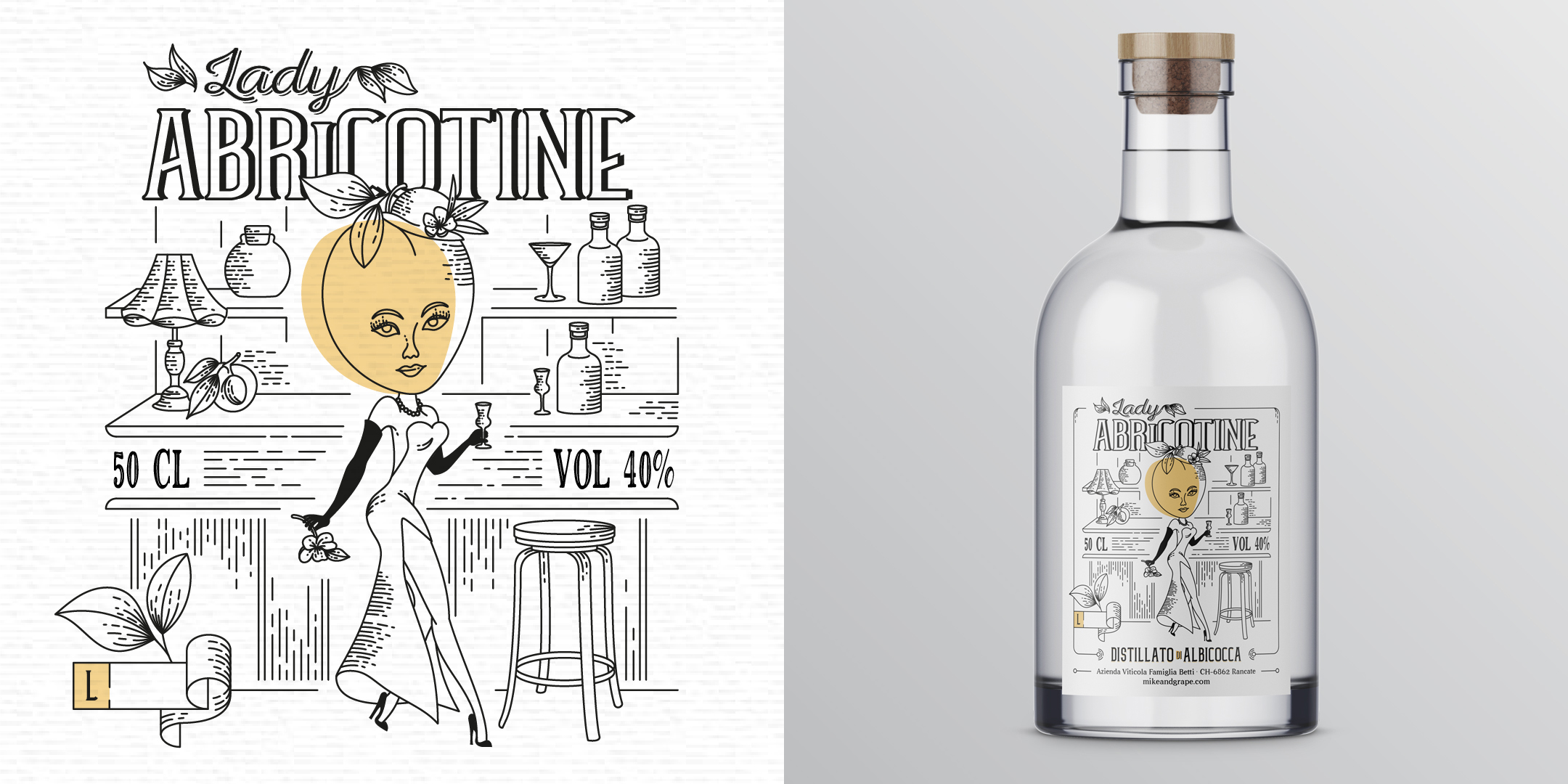
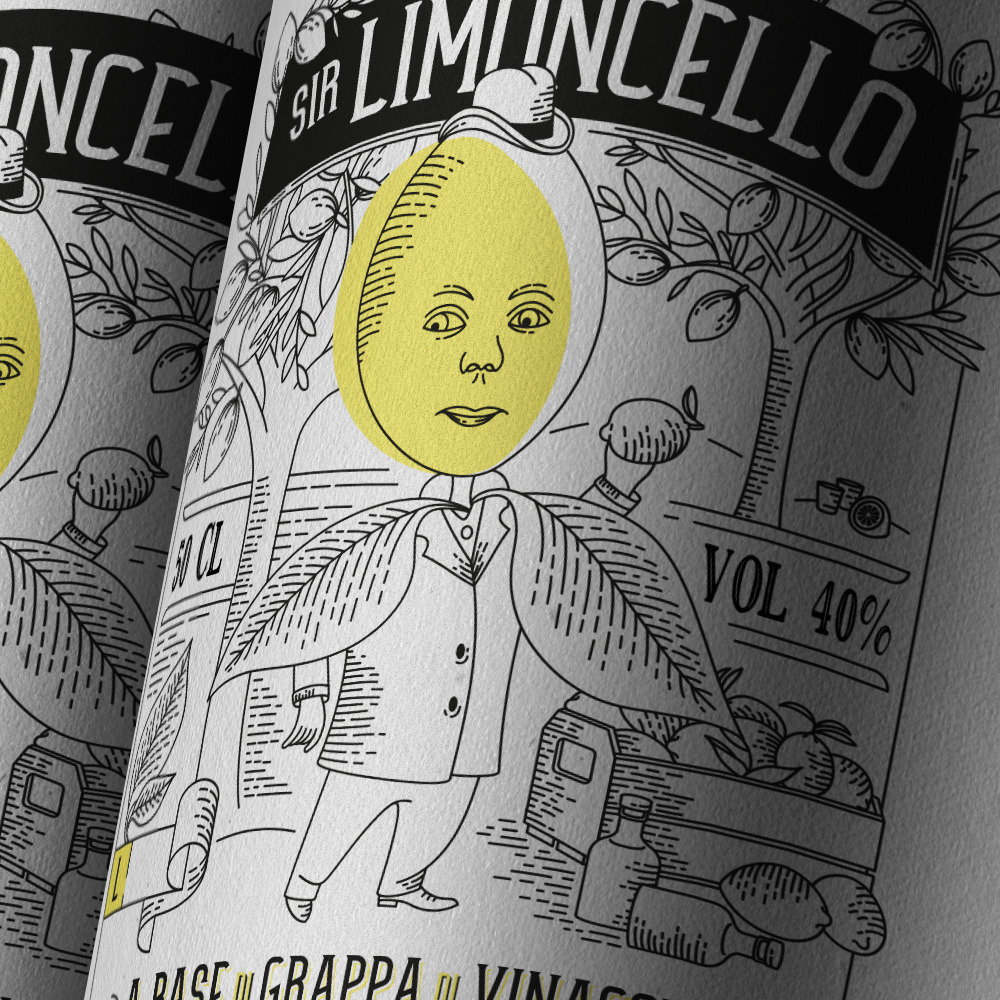
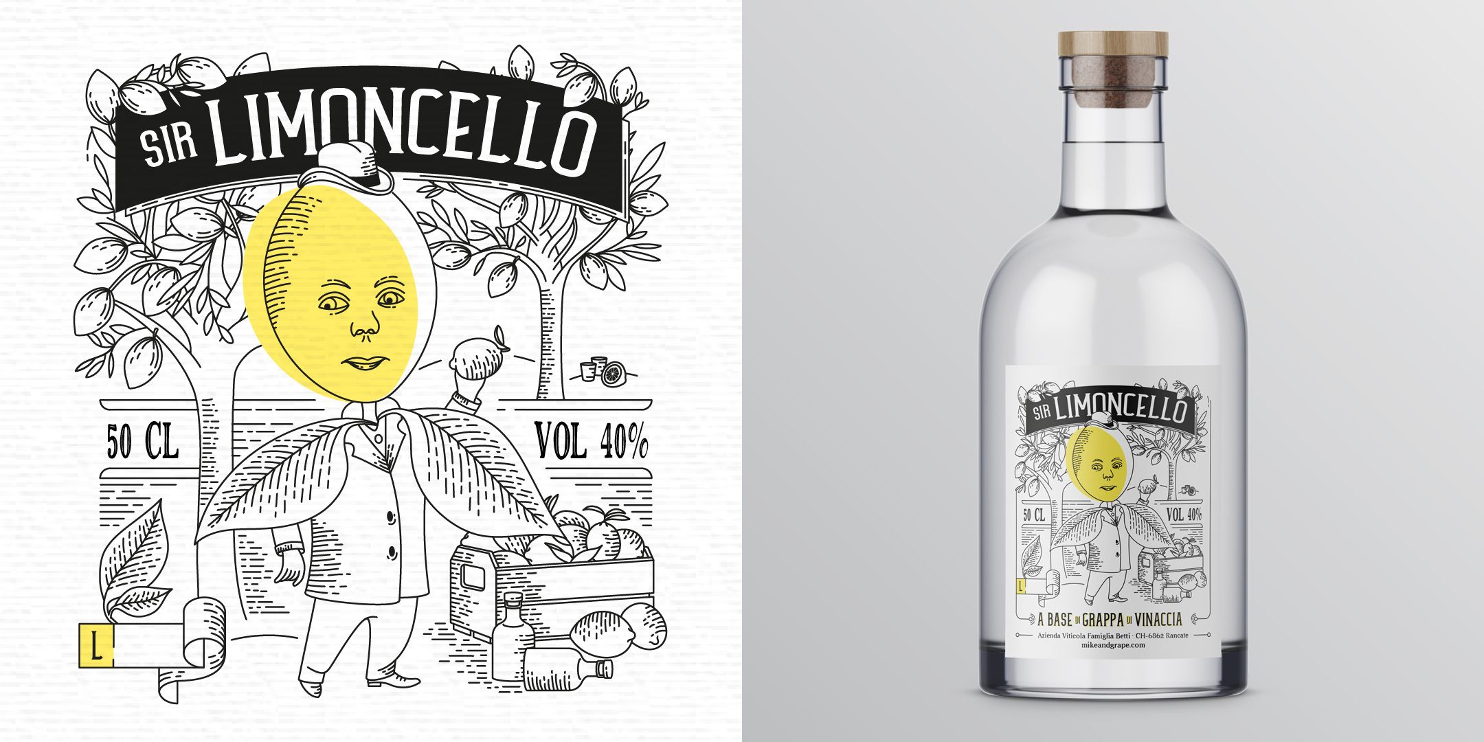
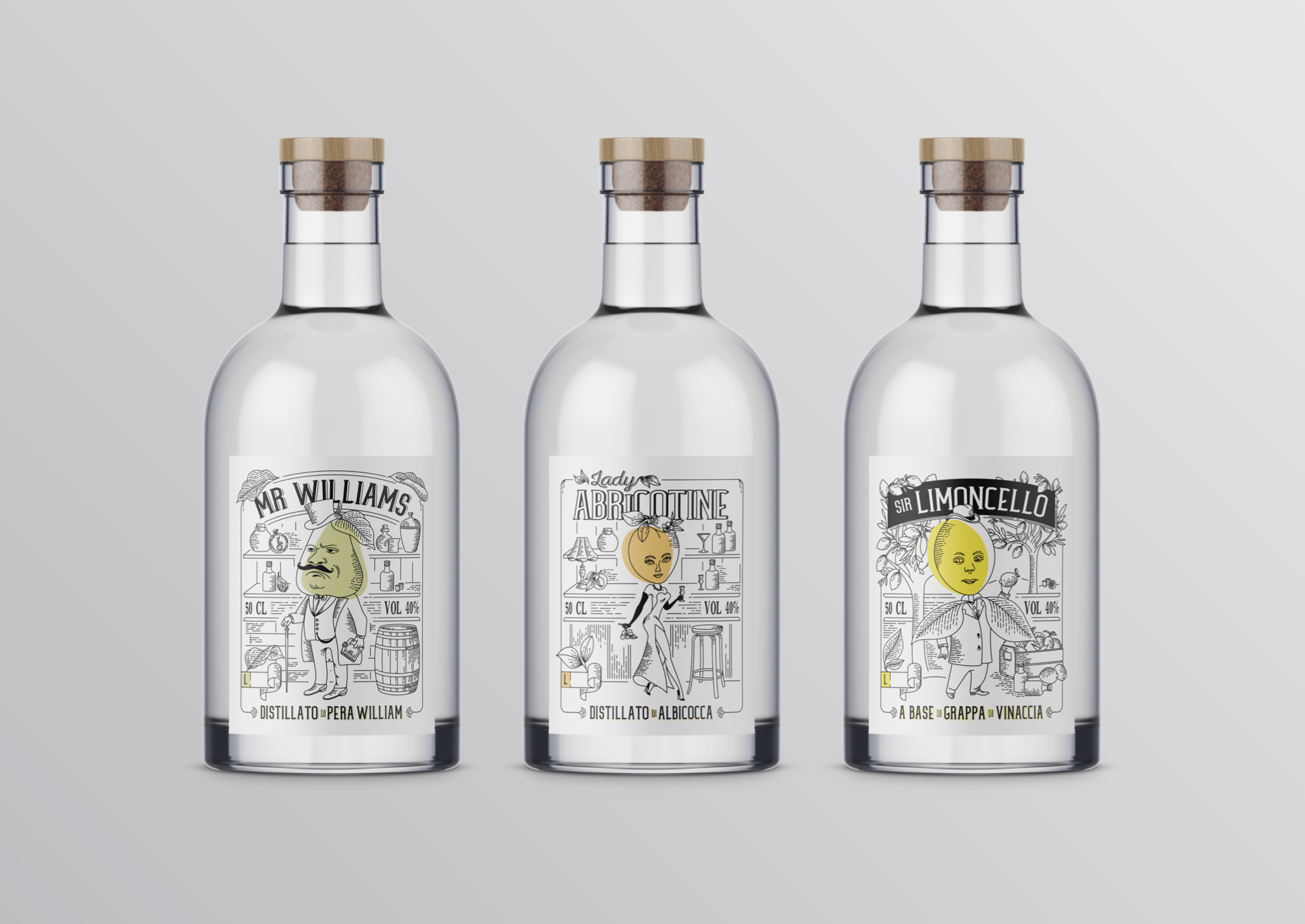
Mike & Grape is a winery specialized in the production of grapes, wines and other alcoholic drinks. This line of labels was designed to launch new spirits and a liquor, each based on a different fruit. The entire visual concept is based on the characters, with fun and very distinct personalities and an illustration style that goes very well with this type of product: very traditional type of drinks but a bit fresh and trying to reach a bit younger public.
Each character’s personality was built from briefs with the client, that explained the conceot behind each drink and so we started sketching until reaching the ideal posture, face expression, clothing and background scenario. The touch of color also helps to identify the main ingredient and lives up the label as a whole. The typography used for the name of the character - which is also the name of the product - is always the same but with different treatments that align with each context and scenario.
The client was so happy with the results that commissioned us to redesign all other 6 existing similar products.
Client: Mike & Grape / Studio: Apis & Co Studio